Death to JavaScript Rock Stars!
We've been listening to your feedback today, about the new jQuery site redesign and one thing has become clear:
Death to JavaScript Rock Stars!
Poor dude didn't even last 24 hours. We wanted to have some fun with the home page, but this bordered on a little too "extreme" for most tastes.
We plan on bringing some further revisions to the homepage in the future, but in the meantime here's a quick overhaul, put together by the always-excellent Scott Jehl, that'll help tide everyone over:
As a token of our appreciation for sticking with the "JavaScript Rock Star" for a day we've included a little Easter Egg in the new site. It would be useful if you knew the Konami Code.
Naturally, the whole redesign still has many tweaks that'll be made over the next couple weeks, especially to individual page fonts, font sizes, and colors.
I want to, once again, thank Scott Jehl for all the hard work that he's been putting in to the site design - and the excellent Varick Rosete (of nGenWorks and Happy Webbies) for the great illustration that he drew for us.
Here's to many happy days of rockin' out with jQuery!
I like the new design!
Now the site just needs a discussion forum — That would make it much easier to help each other out in the community.
The story here is less about jQuery than the growing up of JavaScript.
For years JavaScript engineers have been saying, “No, JavaScript is not a toy, it’s actually a powerful dynamic language.”
The jQuery Rockstar, therefore, was completely off-message.
I’m not sure John Resig “gets” the ramifications of what he’s created yet. From his twitter comments he seems a little irritated by the realization that professional programmers need jQuery to appear to be a professional tool.
It’s always hard when something that was a playful and clever experiment grows up to be useful, and has to conduct itself in an adult way.
But he should be proud.
I normally don’t get involved in such discussions anymore, but could not keep my mouth shut.
Not really sure why anyone complained about the rockstar. I thought it was a fresh approach. I was laughing when I heard that people brought the design down. Really, some people need to loosen up ;)
That design never compromised any corporate promises or lead into a wrong impression of what jQuery was and will be. If you can not sell jQuery to your customers because its frontpage is to flashy, you are doing something wrong :)
For anyone actively using a javascript lib, what counts is its ability to reach goals, not how its frontpage looks.
Sorry but a flashier website just pulls in more people , than the current crippled left over. All that talk about script kiddies, that is how innovation happens, how new blood and new ideas enrich a project. Projects that close their door to the so called script kiddies, loose spirit fast. Not just talking here, I actually witnessed it multiple times.
I have been a jQuery fan from the beginning and sad to see a cool fresh design get pulled down by its community. I am sure the jQuery team stood behind the new design and that is what counts.
Well just my to cents.
And guys keep up the good work.
Cheers
Alexander
two cents that is :)
>>For anyone actively using a javascript lib, what counts is its ability to reach goals, not how its frontpage looks.
There are a lot of books on “branding,” if the events of the last couple days has you mystified.
Thanks ,nice to hear that, really new to me ;) Even though jQuery is community driven, the brand is a symbolic embodiment of what it stands for and is deeply connected to the creator/ development team itself, who decided on the new design in the first place. Its not like it was a bad design. But no need to get any deeper into that. Like I said above, just my 2 cents and no need to overvalue my comment :)
Cheers
Alexander
Ummm, for those that took offense to my comment, it was light hearted and you probably should not take it so seriously. (I think there are pills for stuff like that). I have been professionally in the industry for years now and with much success – and my clients/employers/co-workers have been extremely happy with my results.
That being said, Bring back the rockstar!!
@Ian and Klemen just reeelax. It’s gonna be o.k.
jive – I haven’t taken any offense from your comments.
My post was a general statement to the community and not a reaction to what you had to say – your comment just happened to proceed mine at them time of posting.
Would have been better to put all that effort into being sure the site is viewable in all browsers. As it is, it is not viewable in IE7 (and, no, ‘switch to a real browser’ is not a solution).
As a guess, I would guess the white background box is a div that needs a ‘clear: both’ element so that the white box envelops the content, that evidently is floated.
As it is, there are raggedy white boxes around the ‘Main Page’ heading and the rest of the text is a completely unreadable blue on black.
So where has Mr Rockstar gone? Permanent secondment to Guantanomo Bay, where he will be forced to read the source code for Prototype over and over again until his brain implodes with an audible wumph? Or has he gone to that great big recycling bin in the sky?
Poor b*stard…
Pingback: Thank goodness, they dropped the Rocksta … « Paul M. Watson
Just a quick comment, I can’t spot it being mentioned before (except for an IE6 comment), great new site but it doesn’t work in IE7. More specifically the blog doesn’t work, probably a float issue. The white background doesn’t extend all the way down the page causing the blog to be unreadable. Which is obviously a shame!
Fuck you. I hope you took offense to my comment. The rock star was just a design. It was fun and you bitches complained that it depicted an image the resembled a life. So you lifeless emo faggots decided to fucking bitch and moan and cry like the cunt nerds you are.
Coding is an art. It’s not for lifeless shitstains. Coding is a fucking art and Javascript / JQuery are making leaps and bounds in the realm of web software.
So quit your bitching, assholes.
Love the new design, except for one thing; the latest plugin releases – why can one not go to the plugin description when clicking on the title ? Previous design you could use the breadcrumb (still quite annoying), now the only thing that you get to see is the description of the update, pretty useless, take me to the plugin description (with its real description, demo etc).
oh and by the way; the release descriptions are almost unreadable in camino (too small)
It’s been said here, but I’ll chime in as I still don’t see it fixed. Blog not working in IE7 can wait, but the more important issue is that the jQuery docs don’t display in IE7. I use FF3 for my browsing, but I keep Internet Explorer loaded on my other screen for testing and quickly looking up docs.
O Rock Star estava ótimo.
I’m thinking maybe ‘bad ass’ might of gone over better in the developer crowd than rock star, it doesn’t imply age. Hey even my former boss gave me a coffee mug with ‘Bad Ass’ right on it. So even in the business/corporate environment we can have some charater, right?
Why do differences of opinions have to descend into obscenity-laden retorts? That damages the perception of credibility/respectability far more than the choice of artwork on the main page.
Too bad there is no ‘flag as offensive’ button.
Perhaps it needed to be a short animation instead, about going from mild mannered nerd (professional image) to ROCKSTAR!!!!! (banner image that is now gone).
My question is, why does it have to be professional? Why should the look of the website matter if your trying to sell it to management and clients. Shouldn’t the features be the selling point? It’s not like you can actually SEE it on a website…
Reason, you sound like a rockstar. I’d totally hire you.
pretty lame how you guys change ur sites design on the drop of a hat. grow some balls.
I most feel bad for Varick Rosete, who spent his time and talent on such a great-looking image. Whether or not it should be on the site, his artwork was stunning.
Dude. Decaf.
Man, who care’s about the rockstar. I use jquery because it is, simply put, the best javascript library out there. As long as the documentation works, I’m golden.
Actually, i don’t think Decaf would cure Reason. I think a good ass beating is the only thing that can cure some people. Do you really think he would say that to someones face and get away with it? You can pretend to be anyone you want on the internet, and some people think their god. But he does have a point…
Cheers, guys. Good work on the site. I think you should a picture of Joe Satriani on the home page and say ‘… the satch of javascript libraries’. :)
Man! Wish I viewed the site earlier… the Rock Star Rocked!!! jQuery is so cool it can even bring back the 80s.
[insert elitist comment regarding design target audiences that reveals more of a sense of self-importance than useful criticism]
[insert patronising assumption that Resig doesn’t understand “his” users]
Right. Next topic.
Death to the new design!
– This is a step back for the jquery image.
– The gradients are horrid and the logo is fuzzy.
I like the new look. I would just say the dark blue color looks cool but maybe a little less on the dark but no big deal. Also it was abit confusing because I’m so use to the old jquery logo. The new one threw me off for a second. Personally I hated the old wiki style layout it was slow and sometimes a bit annoying to use. Wiki’s are ironically not all the spetacular in regards to navigation. Only something a programmer could love. Speed is great on this new site.
Unfortunately I didn’t get to see the rock star motif when it was up. Right now, while the new design is attractive, it’s a little too reminiscent of every other Web 2.0 site out there.
I’d love to see some kind of mascot, odd gimmick, or other differentiating part of the design. After all, jQuery is different, its site should be too.
Props on the easter egg. Contra cheat code FTW!
expected a little more from the most excellent javascript library on the web. logo is fugly! horrible font imho.
i’d prefer to be a javascript ninja. ; ) really!!!
Well done Jquery team, Menus, colors, layout, all so nice. the site is very intuitive and looks great. @Ian, some great points made.
Marketing, or focus groups can help heaps. I have been part of a few steering groups for open source projects, and always had fun.
Keep up the great work!
i still miss my “red” Jquery
Love the new site redesign. Would have loved to have seen that “Rock Star” dude, but I came accross the redesign too late. However it sounds like you made the right decision to remove it.
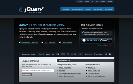
New design is great and very up to date. Like the fact that you didn’t go for a “WOW WEB 2.0” look, and instead went for subtle gradients, clean lines, neutral colours and brighter tone’s for emphasis. Great job.
I don’t care about designs.If jQuery uses a single page with just those download links to helpful resources,it will work for me.I only care how the thing (jquery.js) is working.Does it fulfill my demand?Is it the most useful library?I think all the answers will be a big ‘YES’.I was really shocked reading those responses on the rockstar logo,banner thing.So all of you use jquery because this site looked professional?LMAO!!!Won’t you use it anymore if the site is changed to an ugly design?Well,here is the sad part of making anything ‘so much user friendly’.When the things will be easy to use,it will attract many people(majority of them will be non-professionals).They don’t know whats inside and how it works,they will just see how the site looks(as they are non-professionals).They even have to show their clients jquery.com to get the permission(!!!!) to use jquery.When I work on a project,it depends on me what I will use.If you are client you just check how the things working and if there is any error.It is really a useless community who don’t look inside,don’t respect the hard works,just depends on the outlook.I hope jquery.com will be redesigned to give it more professional look so those non-professional end users get the feeling of being professionals when they come here.
OMG!!!I am loosing my professional mood because of this non-professional look of jquery.com,it makes me to forget all my skills ;)
Pingback: cheung.ctrl v2 - beta
@Sam Hill – maybe we should listen to this guy, or perhaps he should redesign the jQuery website himself, since he just complains about everything. I get really sick of comments, like from this guy, from the community.
And really, if you base a framework off of a websites design and/or graphics, and try to play that “it’s hard to sell this to clients” card, you are just dumb. You don’t sell JavaScript to anyone, you make their site for them, and you make it work, it’s YOU who has the problem, not your client.
Get with the current century folks, and lighten up. Seriously. A lot of you are just a big f’n drag, and honestly, you annoy me to the ‘nth degree. I try and keep positive with what’s new in web technology, but it just seems like everyone wants to bitch and complain. Give it up, go plant a tree or something.
I’d like to see the use of more JQuery on the home page…
Pingback: chromasynthetic » Blog Archive » Goodbye MooTools
Guys Have you seen your page in IE 7??? It’s a complete mess… I can’t even read this post… I had to reload it in Firefox to write this message.
Like Joshua, I have had to use Firefox rather than IE 7 to view the jQuery site. It simply doesn’t work in IE 7, which is a real no-no for a tool which makes cross-browser functionality easy!
The blogs work OK, but all of the sub-sites have the footer obscuring the main text (at the top of the page!) and longer pages have the text going way past the white background, in both columns (and black text on charcoal background definitely doesn’t work!).
I really like the site design (and I LOVE jQuery), but you really need to sort out the IE 7 compatibility.
No, I was wrong, the blog page is also broken in IE 7. I was looking at it in Firefox.
Since JQuery does all the work, it’s more like “Guitar Hero” rock stars…