Death to JavaScript Rock Stars!
We've been listening to your feedback today, about the new jQuery site redesign and one thing has become clear:
Death to JavaScript Rock Stars!
Poor dude didn't even last 24 hours. We wanted to have some fun with the home page, but this bordered on a little too "extreme" for most tastes.
We plan on bringing some further revisions to the homepage in the future, but in the meantime here's a quick overhaul, put together by the always-excellent Scott Jehl, that'll help tide everyone over:
As a token of our appreciation for sticking with the "JavaScript Rock Star" for a day we've included a little Easter Egg in the new site. It would be useful if you knew the Konami Code.
Naturally, the whole redesign still has many tweaks that'll be made over the next couple weeks, especially to individual page fonts, font sizes, and colors.
I want to, once again, thank Scott Jehl for all the hard work that he's been putting in to the site design - and the excellent Varick Rosete (of nGenWorks and Happy Webbies) for the great illustration that he drew for us.
Here's to many happy days of rockin' out with jQuery!
Thanks for listening.
j.
Wow! Talk about rapid response.
In an ideal word, I’d want to see this site bind more tightly to the Devo motif, but I suppose it’s not in your best interests to make it too avant-garde. People rely on this site for information, after all.
fun easter egg John…
but due to the orientation it’s almost impossible to play.
maybe i just have a slow pinky, who knows?
This indeed is a great community. Yes, thanks for listening.
Love the easter egg. And I’m glad you guys removed the whole Rock Star, although it was a nice illustration it just didn’t fit with jQuery.
Great! Goodbye and good riddance to Mr Rock!
Speaking of site design, the secondary navigation bar could use a stronger jq-current style. The rollover is fine how it is, but when you’re actually on the Documentation tab, for example, it would be nice to know it without squinting at the nav bar. Just my 2c.
But the rockstar was awesome :(
To everyone who misses the rock star: Don’t worry, I’m sure this isn’t the last we’ve seen of him – I bet he’ll make an appearance on a t-shirt at some point :-)
Big props to the illustrator, the rockstar was an awesome drawing! Newest tweaks are great.
I really liked the rockstar. It gave the homepage additional life. And I thought most jQuery users/rockstars were of the age to enjoy something like that.
I was a gorgeous illustration either way!
Kudos on the new site, it kicks major arse!
I miss RED. jQuery was always red to me. And the logo RY ligature is weeeeirdd.
I really like the logo text. I’ve been wondering for a while now when it would get, er, backported from the UI site to the homepage.
Major thanks to everyone involved (and extra bonus thanks for listening to us “haters”). ;)
I second that. A red-black combination would’ve fit better, because jQuery has always been so hot! :)
Anyways, thanks John Resig for jQuery, I absolutely love it. We’re about to launch our site 2.0 (Viajeros.com, in closed beta now) and I’ve done a enormous amount of work with it that would’ve been impossible otherwise. As a designer/UI responsible, jQuery made me less afraid of Javascript programming and much more efficient. Thanks again!!!
Pingback: jQuery reDesign
Great.
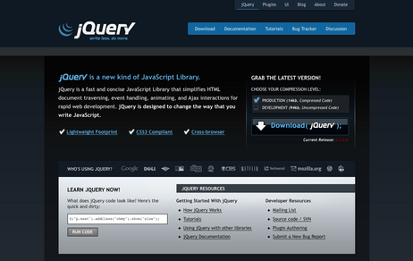
and I suggest to replace the Download button’s text with something like:
$.dl(jQuery);
It more related to “write less…” than Download(jQuery);
and also it more jQuery friendly!
hmm.. My only comments are that some aspects of the redesign just don’t look quite right. The tooltips on the frontpage, the checkboxes for radio selects and the misalignment of the logos in the sponsors section on hover.
My Suggestion: on the Download button, make use of background image animation. Have it fade in or something, I think It’d look much better, and fit in with the smooth colours and clean design of the rest of the site.
Otherwise, awesome redesign!
Thanks for listening. :)
Don’t listen to Siavash; no need to make the download button confusing for new users.
Oops, sorry.
Geez, I really can’t believe that so many people had a problem with the ‘Rock Star’ graphic. I personally never even got the chance to see it, or even comment on it.
It’s great that you listen to people, but I doubt if I’m the only one who never even got to see it.
:(
Yeah I feel much better without him. He seemed so corny to me. But yeah, the easter egg was great, although I failed miserably.
I want a “Javascript Rockstart” t-shirt
Somebody else?
@Abraham: Hmmm that sounds like a cool idea. I need to talk to John about it.
I liked the image, but I was concerned people wouldn’t take jQuery as seriously with it. It’s great to see you guys are responding to feedback. Perhaps there’s a place for the fun side of jQuery somewhere else in the site. A hacker’s portal perhaps?
I agree.. The checks should be replaced with radio buttons, unless you could allow for us to download both at the same time.
The tooltips are a bit obtrusive for me. I’d rather just have that additional text placed below the heading.
The secondary navigation (the lower, larger, brighter bar!) doesn’t make sense for me anymore once you get to the right side of the primary navigation as it is the secondary nav for jquery, not for the selected item in the primary nav.
I would rather see the entire site map in the footer.
Trebuchet MS, yuck! At least specify it after a nice font available on Mac OS X.
“write less, do more.” seems like it should be sharper. It’s always looked blurry, even on the UI site.
Overall I do like the redesign quite a bit, however I feel it’s a bit too busy visually. For instance, setting “Search jQuery” in italics…, too many gradients, etc.
I was thinking the whole “rockstar/ninja” thing was becoming played out so it was odd to see it front and center, horns blazing.
It still could use some work, but is better.
Thanks for listening. The revision looks nice. The publicity seemed to work though eh? ;)
I admire your daring desire for the wild, but it’s true, I do identify more w/ the site as it is, sans-rockstar.
Way to not just listen to your users, but also really thoughtfully consider your audience.
im with that one post – in my mind i will always see jquery as red. i think it would have been a good idea to keep your brand colors. oh well.
the shiny effects on that download button are horrible. it has absolutely no shading/gradients and looks like it was totally thrown together last minute. do you know how many people are going to click that button?! cmon now.
new logo looks like a cross between a mobile cell carrier and cigarettes. :( sadfaces all around for me, sorry guys.
It had nothing to do with it being “extreme,” and everything to do with it being a horrible illustration and completely out of place.
Thanks for listening to the community.
The Easter egg is interesting, however the key handling code on the jQuery homepage needs to return false at the end of the function so Firefox (and other) users with features like Find As You Type turned on can access the egg without tweaking browser settings.
I love all your new brand design… but what I loved the most was the rock dude. :'(… it’ll be in our hearts!.
Long life to the rock-fueled programming community!
Just wanted to quickly throw in my two cents: I visit the jQuery site a lot, mostly due to checking and re-checking the documentation. The layout seems a little cramped now (maybe make the content areas a bit wider?) and it has always seemed easier to look at a brighter, friendlier site. I’m not a big fan of this darker look, but maybe it will grow on me.
Regardless, thanks to everyone involved for all of the hard work and of course for giving us such a great tool.
Is There no “packed” download option anymore????
I’m very impressed how maturely the jQuery web team have handle this, listening to the community and reminding them that their opinion *does* matter. My hat goes off both for the design but also in the way you guys conducted business over the last 24 hours.
Oh noes. I already started showing it around say “look Ma, jQuery haz moar rockstar than f*cking %&?$§$”
I don’t like this new design isn’t friendly for beginners. Please quit dark colors :-s
I agree with the opinion that this dark style and the bad typography in the logo appeals to the 1337 script kiddies, gamers and so on.. The old style was fine.
If you want some new, why don’t you try a clean and light professional look like apple or mozilla? Don’t understand me wrong, the current style is really nice in the quality view, but I think you have a view at the wrong target group.
There is much more potential in the library than this page reflect.
So much better :) Thanks for listening :)
Removing the graphic was a good start.
In way of advice, from the point of view of communication design process, the best thing the branding and evangelism team can take from this exercise is that – jQuery’s target marketing goes beyond individual designers and developers to include members of project teams, corporate decision makers and heads of departments.
The ‘Rock Star’ site design showed misdirection in understanding that target demographic.
The other point I’d like to make is that – “Write Less, Do More” is a very strong and positive slogan – it should be utilised more and embraced as the jQuery tag line. That’s one element of the marketing kit you can happily cross off the list in my opinion.
…and great easter egg ;)
Why not make the Konami-code lead to the Rockstar-version?
That would be handy if I want to sell jQuery to my little nephew :-)
@all complaining checkboxes should be radios:
Have you even looked at the source? Those are styled radios.
@jQuery Team
I think removing the Rock Star was the right decision. It was childish IMHO.
@Nikola
Who cares about source for radios/checkbox? What I see is a checkboxes group behave like a radios group. I think this is wrong.
In this page bottom menu I see “Documentation” shadowed, it’s correct?
@jQueryTeam
I want a rockstart tshirt too!
Thanks for listening. It’ll be much easier to convince people of the awesomeness that is jQuery now that the rock star is gone :)
I liked the Rockstar! :-(
Still, the fixed width is too narrow for viewing tutorials & docs.
Great job on removing the rockstar, which seemed to imply the opposite of the concise beauty of jQuerv, formerly known as jQuery. :P
good move guys
>> Nerd Alert > End Nerd Alert