Blog

Blog » jQuery.com Site Redesign

Posted August 29th, 2008 by John Resig

We’ve just pushed out a brand new site redesign (for jQuery.com and all its sub-sites). This has been a long time coming and it feels great to get it out the door.

New Homepage

jQuery.com

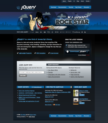
Easily the most contentious part of the redesign – but absolutely the most eye-catching.

jQuery has long been driven by rock, even looking back to its original release which was heavily inspired by the always-excellent Devo. We shot for a catchy design that helped to bring JavaScript out of the cold doldrums that it frequently inhabits – giving it a serious jolt of fun.

New Site Layout

jQuery Docs

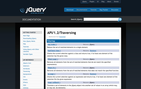
The entirety of the site has a new layout. With drastically improved multi-layer navigation and a standardized sidebar it should become much easier to navigate the individual portions of the site.

You should probably wear a hard hat while exploring the interior pages – font sizes, spacing, and colors are all in need of tweaking, which will be handled over the upcoming week (it’s fun working against Trac, WordPress, Drupal, and Mediawiki simultaneously).

New Logo

jQuery Logo

The original jQuery logo was a variation of the Devo hat – we’ve taken that concept, turned it on its ear, and made it something that we can call our own – while still being inspired by the original contours of the Devo Energy Dome.

Thanks

Site and Logo Design: Scott Jehl – he put a fantastic amount of work into this redesign, bringing it all the way from conception to final implementation.

Rockin’ Illustration: Varick Rosete from nGenWorks also of Happy Webbies fame.

Initial Logo Prototyping: Bradley Sepos.

Also want to thank Media Temple for our hosting. They’ve been helping us a lot this past week migrating our sites to some new servers – expect some speed improvements for the sub-domains very soon.


99 Responses to “jQuery.com Site Redesign”

  1. Jahedur Rahman Says:

    Wow! Realy beautiful!!! :)

  2. Lachlan Says:

    Well, guess it’s time to swap back to prototype then. Way to get taken seriously guys :/

  3. Vincent Voyer Says:

    Very cool and unique !

  4. Daniel Shaw Says:

    Looks great guys. Congrats!

  5. mike Says:

    That’s an interesting design for a code library. :)

    But hey, jQuery has made working with Javascript tolerable for me. John Resig is a god. I hope the new site doesn’t have some of the UI issues the old one did (at least in IE)

  6. Vincent Voyer Says:

    Ahah love the menu effect with double text to make a shadow :)

    One note, the jpg background is too much compressed, it renders bad.

    It has typical lines of jpg low compression of gradients. A 1px width jpg image shouldn’t be compressed.

  7. Marcus Forser Says:

    Thumbs up! It is awesome.

  8. Adam Schilling Says:

    Not a big fan. Sorry guys.

    I’d suggest losing the rock-star quote and illustration (apologies to Varick – it’s a cool illo on its own). Also, the hover effects on those initial checkmarks are a bit erratic and don’t (to my thinking) pitch jQuery that well (sweep across all three from left to right and tell me that doesn’t hurt your eyes – even just a bit).

    Everything else is kinda nice. I particularly like the logo. Dig the library, of course.

  9. jesse Says:

    whoa… just looking for some quick documentation and wha? Home page is awesome — definitely an interesting/pleasant surprise branding wise (sh*t, that rhymed).

    I like how you’ve resisted using jquery effects etc at every turn… Keeps it “grown up” and still fun. Slick design.

  10. Idil Says:

    Beautiful design!

  11. Asbjørn Ulsberg Says:

    I love it! I haven’t browsed through every page variation yet, but what I’ve seen so far is really great. But please make the favicon’s background white instead of black — I think that will look better, as most address bars have a white background themselves.

    Oh, and shouldn’t “Who’s using jQuery” be a link to a page displaying them all? There must be thousands of sites using jQuery and with a separate page displaying them all, I’d say the more, the merrier.

  12. David Esperalta Says:

    Cómo ser una estrella del rock

    Del "rock" del Javascript, no te vayas a pensar otra cosa. Pero ese es el "lema" del nuevo sitio web de la biblioteca jQuery: "Sé una estrella del rock Javascript". No les ha quedado nada mal a los chicos de jQuery …

  13. Dave P Says:

    nice design! i was finally won over to jQuery recently… for ages I preferred scriptaculous and made that clear on my blog too; but I’ve just redesigned my site too and replaced scriptaculous with jQuery and jQuery UI :-) it really IS a more powerful framework

  14. Kelli Says:

    Congrats on getting the new site out the door.

    I’ve been a fan and user of jQuery for a long time. I love the library and use it extensively. I also love the new site-except for the illustration and hover effects on the check marks. It’s an awesome illustration, but it’s hard to take seriously.

    Also, the “Rock Star” text totally draws the eye away from your logo and steals the visual focus on the page-that is, until you hover over the check marks. It’s a nice effect, but it feels too big and awkward, too wide. I can put the mouse over the right of an item and make the box pop up for the one next to it. That doesn’t seem like a good first impression to make when showing off the power of jQuery.

    I mean no disrespect. You guy have built the best JavaScript library on the web and, aside from those two small caveats, the new site is lovely.

  15. Klemen Slavič Says:

    Big fan of the library, but I was unpleasantly surprised to discover the new frontpage. I’d say this new alignment would be better suited and geared towards a crowd of script kiddies and effects junkies than professionals.

    I’ve been using jQuery for a year and a half now and I’ve come to respect the practices that come with engineering, and I’m sorry to say this visual alignment doesn’t match the one I’d ascribe to. It’s hard to be taken as a serious tool when you’re gearing towards a visually-fixated crowd. I would have no problem with a demo site that would feature sort of a forge for effects and tutorials with all the dings and whistles, but leave the main site intentionally bland for all of us that frequent the site with very specific intentions.

    My 2 cents.

  16. jQuery und der Rock’n’Roll - Code Candies Says:

    [...] John Resig zwitscherte es heute morgen in die Welt hinaus: jQuery wurde tutto completto neugestaltet und es rockt! [...]

  17. Jason Says:

    The rock star thing looks stupid an unprofessional to me, but I plan on using jquery regardless of what your home page looks like. :)

  18. cdamian Says:

    Nice library, nice logo, horrible site.

    I first had to check if today is the 1st April.

    I think you might frighten away new users, current users probably just use docs.jquery.com and it is not quite so bad on those pages.

  19. Lunthear Says:

    Beautiful !

  20. Sebastian Says:

    IMO the new design is a little bit “childish” and wastes too much space, but that’s personal taste.

    Where’s the “packed” download? We don’t gz-compress our JS and therefore always downloaded the packed jquery, but now this isn’t accessible on the frontpage, only the minified version.

    And my impression is that the site is still as slow as usual (at least when accessed from Europe, don’t know where jquery.com hosting is located), which is a pain in the a** when browsing docs etc. Can’t you get a better hosting, maybe you could find some company which funds this?

    Sebastian

  21. Luca Says:

    That’s a cool redesign,
    but there’s something to check:
    - the blue menu wraps in Ubuntu/FF3
    - why use checkboxes instead of radios?

  22. Mark McDonnell Says:

    Dear god!!!?

    Seriously, I like the sub page designs but the graphic on the home page of the cartoon character is useless/awful! It makes jQuery look very immature and kid’ish.

    I appreciate that you want to inject some ‘fun’ into a very geeky aspect of life (face it, programming is a very boring subject for a lot of people) but jesus guys find some other way of being funny and/or unique as that cartoon character is horrible and absolutely off-putting.

    Maybe I’ll pass this link around to some people and see what they think, but my initial reaction is: all good, except that cartoon character!

    Kind regards,
    M.

  23. Johan Sahlén Says:

    I like the new site design, and the logo is ok I guess, but the illustration and rock motif on the home page feels really unprofessional. If I came to the site without having used jQuery before I think I would write it off as, like Klemen Slavič said, “script kiddies and effect junkies”.

  24. Ian Says:

    Overall, the refresh to the site design is welcome, however I do have some feedback that I would like to share regarding the logo and the home page image.

    Logo:

    The original logo graphic had a connection to the Devo reference – which, for better or worse, had personality. However, the new abstraction away from the original motif has left the current graphic in the ranks of the generic ‘swoosh’ category.

    I’m also not a fan of the typeface – Blade Runner meets Star Trek. It’s typical of work that aims to be futuristic and cutting edge, to the point where it ends up firmly in the 80′s Sci-Fi school of design. Unless of course, that was the objective from the outset :)

    Splash header:

    The illustration is well executed and the notion a playful one, but as a graphic designer and client side developer, I’m less interested in being a Rockstar and more interested in being a professional craftsman.

    Obviously, I use jQuery for jQuery and not the ‘site design’, but communication design always has an impact, and the sentiment of this graphic is that (for me at least) – as a reflection of jQuery’s potential future direction – it points in a different direction than I intend to head as a developer.

    I guess I could dilute the above statements down to a couple of simple representations:

    Design: Less David Carson, more Paul Rand please
    Development: Less Joshua Davis, more Douglas Crockford please

    (Disclaimer – I respect and enjoy the work of each of the above designers and developers and it’s not a measure of one being ‘better’ than the other – only a representation of where I’d prefer, or previously imagined, jQuery to be orientated)

  25. adb Says:

    I’m inclined to agree with Johan and Klemen.

    Not to minimize all the hard work that went into the site — certainly it is deserving of praise — but it just doesn’t seem to match jQuery anymore. The old design was professional and colorful; this one is far too gloomy.

    Every change, for better or worse, has its detractors, so I apologize for being one of “those guys.” I’m sure I’ll get used to it in time.

  26. Philip Morton Says:

    The old design was far better; this one looks so unprofessional. It’s going to be so much more work trying to pitch this to colleagues now. A massive step down from the old site.

  27. Ric Says:

    Very nice, good to see you have your own image and I think it fits jQuery well. jQuery can be used to make sites more fun and interesting to use for Joe Public who have no interest in how the site works.

  28. Kris Khaira Says:

    The new logo is nice but I don’t like the rock star graphic and the new design is quite messy. The previous site was a lot more cleaner.

  29. Michael Dingler Says:

    Oh no, it’s the post-punk, alt-rock mano cornuto. Now you made Dio angry…

  30. blocger Says:

    Execellent. congratulations.

  31. redsquare Says:

    Congrats John et al. Like the design and fun feel.

    Unprofessional? Come on it’s a js library not some snotty consulting company…..

  32. suy Says:

    The slogan is quite similar to the Qt one: code less, create more. Makes sense, since the two libraries are just great. :)

  33. Chalda Says:

    Fantastic! Congratulations!

  34. Jonathan Snook Says:

    Here are my thoughts: Keep the illustration. In fact, add more. And put them in rotation. Show people that you can be everything you want to be with jQuery. (A ninja illustration should be next on the list. (or a samurai since book publishers seem to like that better!))

    I like that the site is now aligned with the UI site. I agree that the devo hat now is a little swooshy but I think the nod to its past is good. The jQuery wordmark is the most important part and I think it stands on its own and wouldn’t change it. It has enough personality.

    However, I’d be remiss if I didn’t complain about *something*, but for me, it’s actually the width of this main column. I find it too small, especially in the documentation. Bumping it out another 50-100 pixels would make a world of difference.

    Also, it’d be cool if the logo and top navigation lined up perfectly with the UI site (which, incidentally, is slightly wider!).

    All in all, I’m cool with the new look. Some people just don’t like change. jQuery is a framework put together and managed by a bunch of nomads. It’s people who’ve come together from around the world to maintain a great library all for the fun of it. I think the site is a reflection of that.

  35. Matt Wilcox Says:

    I love the new look. I think it’s great that you’ve taken a dry subject that normally inhabits ‘functional’ looking site designs and given it some artistic design flair. Which after all is exactly what jQuery is about – ditching the technical mumbo-jumbo and allowing easy creativity. Spot on concept, great execution.

    Sadly, the same attention to detail from the homepage clearly hasn’t made it to the sub pages, which look at best half finished. Come on guys, in for a penny in for a pound right? So why are the content pages just boring black headings in a boring default font? Why is all of the content just a series of boring lists? The interior pages look like they got about ten minutes of thought into all of them combined, when the homepage clearly got days of love applied to it.

    Regardless, this is a great re-design, congratulations :)

  36. Daniel Says:

    Really beautiful new layout, congratulations. I like it very much.

  37. Leo Ruggeri Says:

    The new design is really beautiful and clear. The only thing i don’t like is the “hip hop” style rockstar illustration.

    Thanks for the great work

  38. Floris Baan Says:

    I like it! I was in shock, but I like it!

  39. Jeroen Ruigrok van der Werven Says:

    Most of the redesign I can appreciate, but I agree with the sentiments that at first site it feels script kiddie-ish. Within companies this is already an important process of the “pitch” for using jQuery.
    The rock image causes me to have to scroll to even read more about jQuery, which cannot be the aim, now can it?

    Also why such a narrow use of the available monitor space? The image stretches side to side on my browser window, but for the content of the site someone was happy using only 50%? This causes me to scroll much more through the site’s content, highly distracting!

    The website now is making me do more, not less.

  40. daniels Says:

    jQuery rocks

  41. Kees Says:

    It looks good, but it doesn’t fit the website in my opinion. Also, the contrast between foreground and background on the text-pages distracts from the content.

    I would’ve gone for a more serious look.

  42. Boris Strahija Says:

    Great redesign. The main navigation could use a hover effect :)

  43. uncosy Says:

    相当不错的设计!
    cool!

  44. adb Says:

    YES. Jonathan Snook’s rotation suggestion rocks almost as much as the dude in the drawing. That would be a reasonable compromise. I can deal with the color scheme. >_>

    I just… don’t think that illustration should become jQuery’s mascot, you know?

  45. Yusuke Kawasaki Says:

    Cool!

  46. syl Says:

    Very cool !!!

  47. Alistair Davidson Says:

    I actually like the new design – with one (usability) caveat:

    The Production / Development checkboxes are mutually exclusive, so they should be radio buttons, not checkboxes. Using checkboxes for exclusive options is a big no-no! Worse, people who don’t know any better may get the impression that this is an acceptable practise, by seeing it on such a well-respected site.

  48. Matt Nowack Says:

    I like the redesign in general but I agree with the others that the Rock Star image is fairly childish. If it is to be kept, maybe moving it below the content and giving it a better reason to exist, other than just being nifty looking, would mitigate its childishness. Maybe you could use it to link to profiles of people using jQuery in neat applications like Digg or Google.

  49. George Thompson Says:

    Great Job John and TEAM jQuery is moving forward furiously- each step it is more amszing. I’m very glad that I picked a winner when I decided that jQuery was the library to use. Long live jQuery!

  50. Greun Says:

    Nice design!

  51. Peter Says:

    Jesus, are we MTV rockers now? I like jQuery because it’s powerful and reliable. The drawing on the front page looks like jQuery’s for children and the design overwhelms the content.

    I know with every redesign there’s people who cry “I liked the old way better!” I’m not. I’m saying I’m too ashamed of the way the site looks to give out a link to recommend another adult use it. The design is not “strong” or “edgy”, it has overpowered your content and made it impossible to do anything but boggle at it instead of learn about jQuery.

  52. emaia Says:

    Cool.

    In docs, demos don’t work in Opera 9.52

  53. Sean O Says:

    Great job on the redesign guys.

    Not the biggest fan of the cartoon. Makes the site seem a bit, well, cartoonish. The home page feels like something I’d have to hide at work when someone walked by.

    Perhaps another take on the Rock motif? Keep the background & ‘ROCK STAR’ typography, it looks great.

    Maybe a Guitar-Hero-esque screen with jQuery logos flying down instead of pulses, with a shadowy figure ‘playing’ a keyboard… Or a wide shot of a concert scene drawn in deep & dark blues…

  54. former evangelist Says:

    I used to recommend people use jQuery, but now I think I’d just look stupid if I sent someone here

  55. Agent G Says:

    Interesting design, I like it! I find the rock star bit amusing, especially since when I got into Twitter I kept saying “I can follow the rock stars of web development on here”.

  56. Bastian Says:

    yeah!
    rounded corners for firefox!
    why don’t you use one of the rounded corner plugins?

  57. jive Says:

    It looks nice.

  58. CartoonHariKari Says:

    A cartoon rocker? Really?

    It’s a nice illustration for a band’s web site. It makes jquery look amateurish, however, and as we all know, jquery is anything but.

    Jquery rocks on its own, it doesn’t need a cartoon rocker to make that point.

    The rest of the redesign looks great!

  59. mike Says:

    I just went through the arduous task of replacing my home-grown javascript framework with jquery. Looking at your site redesign, I am a little embarrassed that this is the framework I chose. It makes jquery look like a script-kiddy framework, rather than a professional tool. Please consider adding at least a small amount of professionalism to your design by removing the rock star quote and the infantile/visually unpleasing illustration of the greasy unkempt and immature coder.

  60. Mike Bobiney Says:

    Writing this while the song “Whip It” is stuck in my head…

    I personally wasn’t expecting the cartoony look of the home page and while taking a fun approach to can be nice, I would have to say that it feels overdone and as other commenters have mentioned, a bit unprofessional.

    However it is nice to see the “who’s using” area front and center. Perhaps providing a link to the full listing of companies as well?

    And finally, I’m not a designer per se but I think the new logo is growing on me.

    whip it.. whip it good!

  61. Vincent Murphy Says:

    The blog seems to have two body tags and center tags? Needd some HTML cleanup, stat!

    The main page almost validates: encode those pesky ampersands in links and it will!

    Looks greats. I like the various blues.

  62. Delirios de un Informático Says:

    [...] “Be a JavaScript Rock Star”, ese es el nuevo lema que el framework jQuery ha adoptado con el nuevo diseño de su página principal (Via aNieto2K) [...]

  63. Jason Says:

    I’ll be honest, the homepage illustration threw me a little bit, but overall, I really like the new design.

    And seriously, folks are thinking of dumping jQuery simply because they don’t like one element of the new site design?!? That seems rather silly to me.

  64. Chris Charlton Says:

    The site is built on top of Drupal?

  65. skankster Says:

    I really like the new design. I think it is as state of the art as jquery. So please keep on rocking guys.

  66. Jared Says:

    Hmm, I like some of the changes. However, the biggest issue in my mind is the message – it’s become diluted. When I glance at the page, the last thing I think of is development, instead I think more of games or music, etc. Looks nice though!

  67. HeathNail Says:

    Anyone that is concerned about the image is well… too concerned with image.

    As long as the code is good and the site is usable, I’m not complaining :) Long live jQuery!

  68. Laisvunas Says:

    Old design was good enough.

    Instead of new logo, images and color scheme you would have rather established a decent discussion forum. Mailing lists sucks. Discussion forum would be most effective means for evangelizing jQuery.

  69. Jared Says:

    Wow I came to the site and thought I was on some second rate fan site for a second. You lost a lot of professionalism with this move and it’s going to be a hard sell to my boss when choosing frameworks.

  70. Garrett Dimon Says:

    The new design is incredible. I love it. I have to respectfully disagree with everyone who is concerned with the illustration. It really gives the site some energy and uniqueness. There’s nothing wrong with the messaging. Keep it up.

  71. Steve Goguen Says:

    FYI, I’m not going to pull any punches here.

    It’s a nice layout, but kill the drawing. I can’t emphasize how much that drawing alienates sober people who want nothing to do with being a ROCK STAR.

    I’ve been recommending jQuery to people for years, but now I’ll have to protect my credibility by adding a lot of disclaimers like: “I know the rock star guy and the tag line is douchey, but trust me, it’s an awesome library.”

    I can understand that you might want to seem a little brash, but trust me. This is not it.

  72. stanleyxu2005 Says:

    Great works! New documentation is better than the previous one.
    The portal page is however too dark.
    To note, the documentation page is always slow to response. It takes usually very long time to open it.

  73. Peter Pistorius Says:

    “Be a javascript rock star” is rather unprofessional.

  74. Tom Tobin Says:

    Wow, the new design is, um … I can’t mince words here: it’s awful. At the *very* least I hope you’ll consider ditching the “rock star” graphic and tagline; even then, it just goes from looking like a Rock Band fansite to a Star Trek one.

    I’m no stranger to jQuery; we use it extensively at The Onion, and we love you guys for making the best JavaScript library around. We’re a bunch of geeks, and we appreciate silliness … but this design just doesn’t click. (Now if we were talking *ninjas*, it might be a different story altogether.) ;-)

  75. dani Says:

    the redesign looks great except for the rock star illustration, it doesn’t work for me…

  76. eric Says:

    Fire your designer pronto.

  77. Jeremy Ricketts Says:

    Was a little surprised myself. There are two taglines on the page “Write less. Do more.” and “Be a Javascript ROCKSTAR.” I’m guessing the people we have to try and convince (clients) to sign-off on jQuery could care less about the us developers feeling like a rockstar and more about… well, doing more with less code.

    Design should achieve some sort of objective. What’s the objective to this design? Whatever it is it doesn’t seem to jive with what jQuery is- an intuitive, less-is-more, mature, and even elegant javascript framework.

    It’s weird to think that the site design could actually be an obstacle in getting people (managers, clients, lead developers, etc) to sign off on jQuery. We’re not all in a position where we can just use whatever frameworks or tools we want.

  78. Ahot Says:

    So light product and so dark homepage. Interesting contrast.

  79. JQuery se lava la cara | sometimes_i_dream_about_reality Says:

    [...] Más información en su blog. Be a Javascript Rock Star! [...]

  80. Ajaxian » jQuery.com redesigned with a Rock Star Says:

    [...] When I was doing an interview with John Resig for the Open Web Podcast, he mentioned that the redesign of jQuery.com had a lot of people talking, and it seems like people have strong feelings about the Rock Star for whatever reason. [...]

  81. Peter Chon Says:

    Yeah. I agree with the majority. Not digging the new “hip” look. There are better ways to convey edgy and technical feel. The illustration screams “My nephew is a great artist”.

  82. Andy Says:

    Great design, guys (and navigation overall).

    Also, thanks for providing us with a “rock”-solid JS library ;)

  83. Emarts Says:

    I dont like it, is too «guitar hero» :-S

  84. Antonio Bueno Says:

    Love the logo, lose the rocker.

    Also check the inconsistence of the menu in Opera 9.52

  85. bugeats Says:

    Yeah… not feelin’ it.

    Trying to make a javascript library look like it has anything to do with being a rock star is just embarrassing.

    You should stay style-conscious, but try to focus on communicating the technical and engineering strengths (which in this case ARE very hip and progressive) of jQuery.

    Yes Emarts, you nailed it with “too guitar hero.” Other than being distasteful, I worry that it will hurt the adoption of my favorite bit of kit among the uninitiated.

    A quick fix would be to get rid of the cartoon on the front page.

  86. Learning jQuery » jQuery Site Redesign - The Community Speaks Says:

    [...] As many of you have seen by now, the jQuery Project’s site has been redesigned. It had been a long overdue task and it was important to put a fresh new spin on the main hub, and the face, of jQuery. One of the things about the jQuery Project is that we’ve never run with the crowd or accepted the norm. By pushing boundaries and sometimes being “in your face,” we’ve not only grown tremendously in popularity but we’ve pushed most of the other JS library projects to rethink their own principles and make changes to improve their products. That’s a good thing for everyone as competition is always good. [...]

  87. Schimbare de design la CNet.ro | CNET.ro Says:

    [...] Zilele acestea mai multe situri cunoscute ÅŸi-au schimbat designul. 27 august – TechCrunch; 28 august – DigitalInspiration; 29 august – jQuery. Nu este uÅŸor să schimbi un design. ÃŽn special psihologic. Fac situri de aproape un deceniu ÅŸi am avut de mai multe ori parte de protestele unor vizitatori fideli când am schimbat designul (de exemplu la Catholica.ro). Sunt sigur că nu e schimbare de design care să nu împartă vizitatorii (nu neapărat în tabere egale) în nemulÅ£umiÅ£i ÅŸi mulÅ£umiÅ£i. Dacă veÅ£i citi comentariile la schimbările de design tocmai amintite veÅ£i vedea ÅŸi acolo n persoane care, mai politicos sau nu, au protestat împotriva schimbării designului. Poate cea mai neinspirată (uite că sunt ÅŸi eu din tabăra nemulÅ£umiÅ£ilor) e cea de la jQuery. Rockerul din design ÅŸi opÅ£iunea pentru prea mult negru nu ÅŸtiu câţi o vor găsi atrăgătoare. Dar… mai grav… sunt problemele de afiÅŸare. De exemplu în IE noul design de la jQuery dă multe ÅŸi urâte erori (poate când veÅ£i citi materialul ele vor fi corectate, de aceea am pus mai jos niÅŸte "dovezi"). Ca de obicei, în FF ÅŸi Opera totul merge fără probleme. [...]

  88. tyrabanksqueefsnoggler Says:

    Head, left hand, and keyboard are poorly drawn.
    Honestly, it’s the only weak point of the whole design.
    I see where you were coming from with it, but you didn’t get all the way there.
    Redo the illustration.

  89. Marcelo Says:

    Really nice design, and very good logo. I suggest taking out the “javascript rockstar”. I don’t know the effect that the new design could have in begginers… perhaps it scares a little (the old design didn’t)

  90. Dan Says:

    Lose the crappy illustration your next door neighbor drew and just smash the div above it and the one below it together. Then the site will look a lot more professional and something I could actually show managers and say we are using in a professional environment. I don’t understand why jQuery would want to associate it self as the myspace of javascript library’s.

  91. Eric Martin » jQuery.com Redesign Causes Pandemonium Says:

    [...] Sorry, I couldn’t resist the title. Perhaps short of true pandemonium, the new jQuery.com redesign has caused quite a stir. It sounds like they are going to make some changes, so I’m adding a screenshot for historical reference: [...]

  92. Joe Chung Says:

    I like the site redesign except for the incredibly tacky hero graphic. Absolutely awful.

  93. Wojtek Says:

    Wow, I just looooove it :)

  94. jQuery: » Death to JavaScript Rock Stars! Says:

    [...] jQuery.com Site Redesign [...]

  95. John Resig Says:

    Thanks for your feedback, everyone!

    More details here:
    http://jquery.com/blog/2008/08/29/death-to-javascript-rock-stars/

  96. jQuery reDesign Says:

    [...] As many of you have already noticed, our beloved jquery.com had undergone a redesign. I heart jQuery quite a bit and hate to bash the new design, but all I could think of at first glace was – what were they thinking? [...]

  97. Technikwürze » Technikwürze 117 – Querfeldein Says:

    [...] jQuery Redesign Desaster: Be a JavaScript Rockstar … Teile der Community haben verbal sehr heftig auf die Macher “eingeprügelt”, sodass das Redesign nicht mal einen Tag überlebt hat. [...]

  98. jQuery macht Dich zum Rockstar « jQuery, Funktion, Framework, Bisher, Redesign, Javascript-Dummy, Codebeispiele, Hinzu « ajaveeb Says:

    [...] Passend zum Redesign der Website von jQuery kommt heute die Überschrift für diesen Beitrag. Leider hat der Claim auf der Startseite nicht einmal 24 Stunden überlebt, in dem es hieß “Be a Javascrip Rock Star”. Bewundern kann man ihn aber noch, nämlich im offiziellen Blog. [...]

  99. chromasynthetic » Blog Archive » Goodbye MooTools Says:

    [...] Anyone remember when the jQuery site got redesigned with the javascript rockstar? Remember how quickly it was removed based on user feedback? If you don’t like jQuery as a library, you definitely have to respect their attention to the community. Now here’s the opposite response. MooTools 1.2 was released, and with that release, the forum was removed. There was no prior warning and it was weeks before we had any official word on what happened to it. Understandably, a lot of the community was upset. If I had discovered MooTools in that state, I would not have adopted it, but even after that, I stuck with MooTools hoping they would get better at interacting with the community. [...]